The reason why you’re given free samples in shops
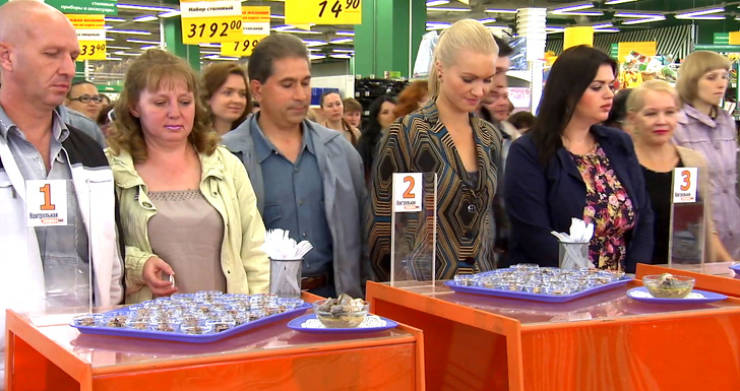
In shops, you can often see young, handsome promoters offering a free taste of a new variety of sausages, ravioli, and other products. However, this isn’t done to make you fall in love with a new product.
In fact, people are offered to taste something edible for free for the sole reason of making you feel obliged. For example, when getting an unexpected gift from a friend, you usually make the decision to give them a gift in return. The same principle works here.
Emotional presentations of any product cause potential buyers to have much higher neural activity in the brain than simple presentations of products would. All because a consumer perceives emotionality better than rationality.
The magic of numbers on price tags
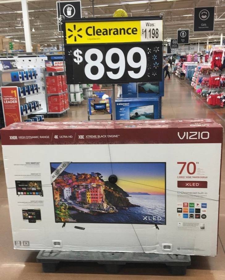
Yes, retail chains like to write “$99.99” instead of “$100” on price tags in order to make the product seem cheaper to us. In addition, unrounded numbers give us more confidence. But it’s really the magic of numbers that our brains like best. We know that we’re used to seeing the number 9 on pricetags, however, the numbers 7, 5, and 4 also work well.
For example, in order to increase the sale of a product, you only need to put a similar type of product next to it with “unattractive” numbers like 1, 2, 3, 6, or 8 on it. It’s likely that our brain will choose a product with the price tag that displays “attractive” numbers, even if it costs more than the competing product.
Mirrors in supermarkets
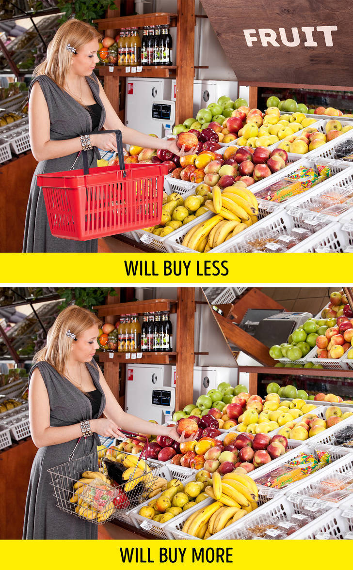
Have you ever noticed that there are many polished surfaces where you can see your reflection in supermarkets? It’s made to give you the chance to admire yourself. For example, mirrors that can often be seen over shelves of fruits and vegetables are not there for nothing. Yes, they do help to see the product better and to broaden the space visually, but the mirrors serve an even bigger purpose.
Mirrors in shops make us slow down our steps. Subsequently, if you stop to look at your reflection (it often happens subconsciously), you’re likely to pay attention to the goods that are located near the mirror surface and there’s a higher chance you’ll want to buy them.
Words with double meanings on packaging
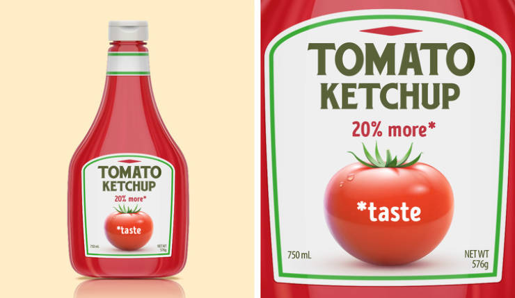
If the package of your favorite ketchup or mayo has suddenly become a bit larger and has a sign saying, “20% more,” it doesn’t mean that the amount of product inside the package has increased. Sometimes the small letters under this claim (or on the reverse side of the packaging) have an explanation such as “20% more taste,” or “20% more pleasure.”
This trick marketers use can be a sensible and logical (at first glance) explanation for the small rise in price for the product without actually increasing the cost of its production. It’s because customers rarely read all the information on the reverse side of a product and never look at the paragraphs written after its description. An air freshener sitting in the bathroom is perhaps the only exception to this.
Pain is the best stimulus for a purchase.
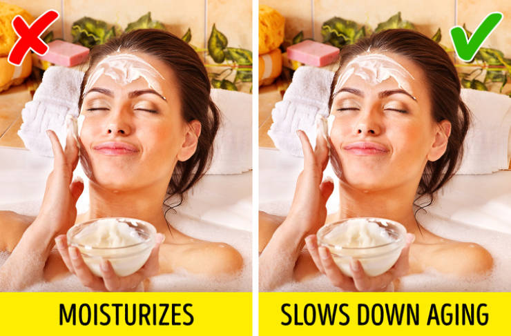
Oftentimes, product packaging, as well as commercials, show us messages declaring a product can solve any problem. For example, you’re likely to choose a cream with packaging that says it slows down aging over one that simply claims to moisturize or calm the skin.
As strange as it may sound, a pet peeve causes a much greater desire to make a purchase than pleasure does. It means that the product which says it can fight all our problems or help us avoid them will always be in high demand. And it’s all because our brains choose the correctly chosen words (not the composition) on the tag.
Sellers and buyers need to have a common enemy.
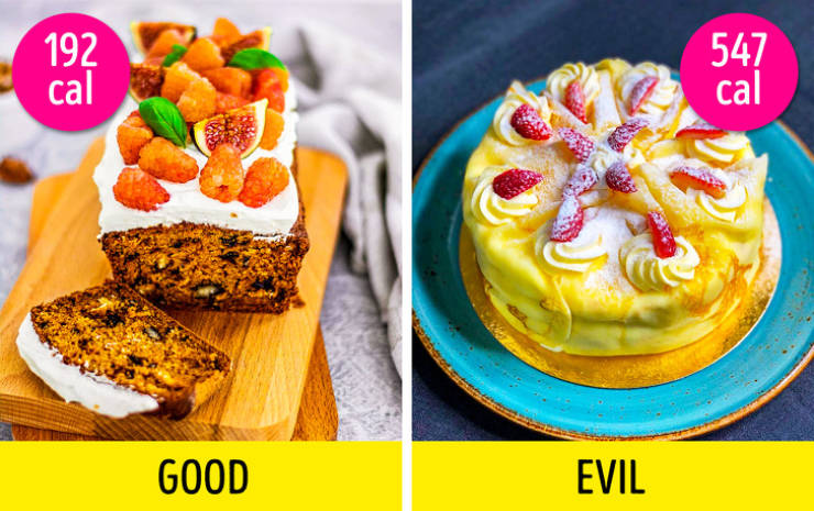
In life, we can become friends with someone if we love the same person or can join with other people if we’re collectively against the same person. The same notion can be applied in sales. Marketers try to find a common enemy for consumers of their product to make them buy the “better” one.
For example, many manufacturers know how much you want to eat sweets when you’re on a diet. That’s why they produce products low in calories that still have plenty of sugar. In this case, extra calories are a common foe for both you and marketers, and it’s easy to fight them if you choose a product low in calories.
Trigger words
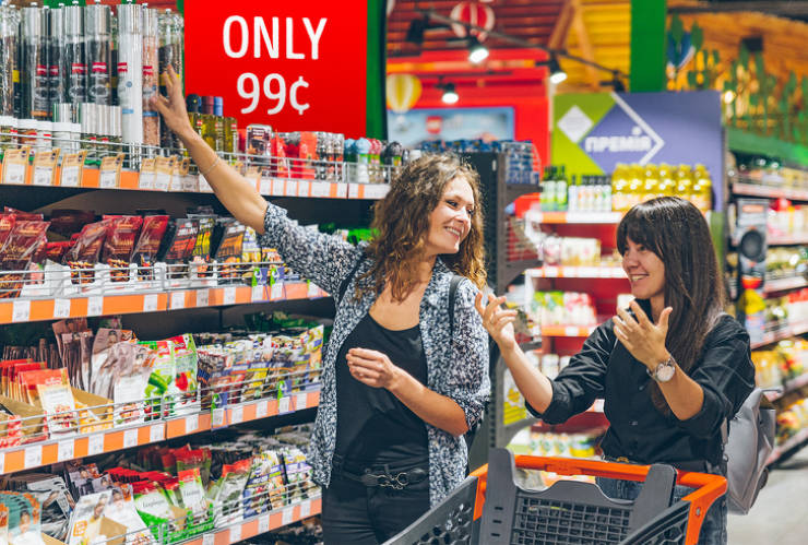
There are many words that creative marketers use to make you want to buy a certain product. You can often see big red price tags in supermarkets saying, “only 99¢”.
Additional trigger words along with a pricetag artificially minimize a product’s price. It means that our brain thinks that between a product for “99¢” and one for “only 99¢,” the latter is a more reasonable option.
More doesn’t mean cheaper.
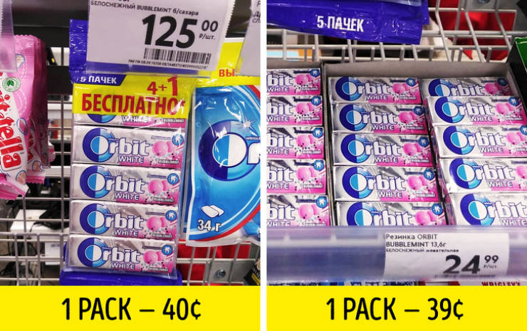
Always keep in mind that there’s no such thing as “free”. Any product that says you’re going to get something for free always implies that the gift is already included in the price. It means that sometimes 5 bubble gums in a pack (buy 4, get 1 free) won’t cost you less than buying 5 packs of the same bubble gum individually.
Oftentimes, this kind of offer for the same product is located in different parts of the store so that customers aren’t able to compare the cost and realize that a profit doesn’t exist.
Product consistency is a sales engine.
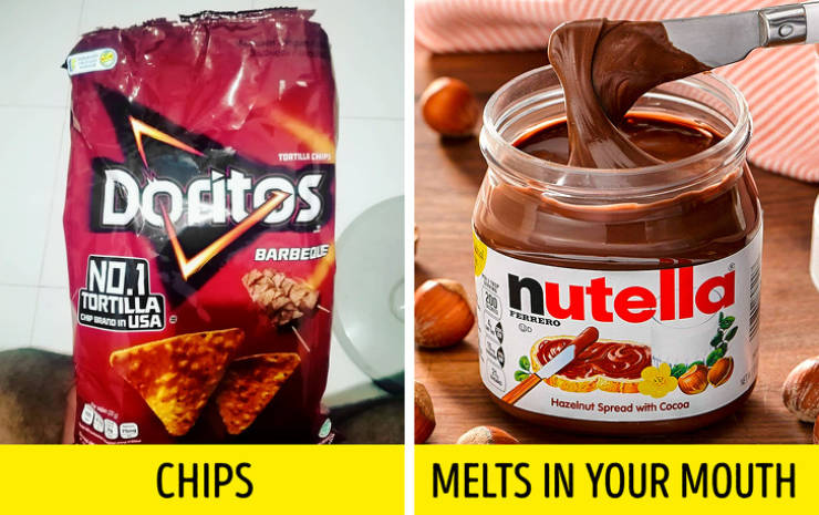
Not only do marketers come up with loud slogans and commercials, but they can also take part in developing product composition. For example, they know that a product’s crispiness won’t let you stop after eating half the pack, while a creamy texture of food creates an illusion of low calories because it melts in your mouth and our brain perceives it as a light snack. You won’t even realize that you’ve eaten a bit too much.
Salivation affects the taste perception of a product.

Butter, as well as chocolate and various sauces, increases salivation and allows you to imagine the taste of a product better. That’s why goods with such components often seem more attractive and delicious to us even when we’re simply looking at packaging displaying them.
The color of bananas that makes us want to buy them
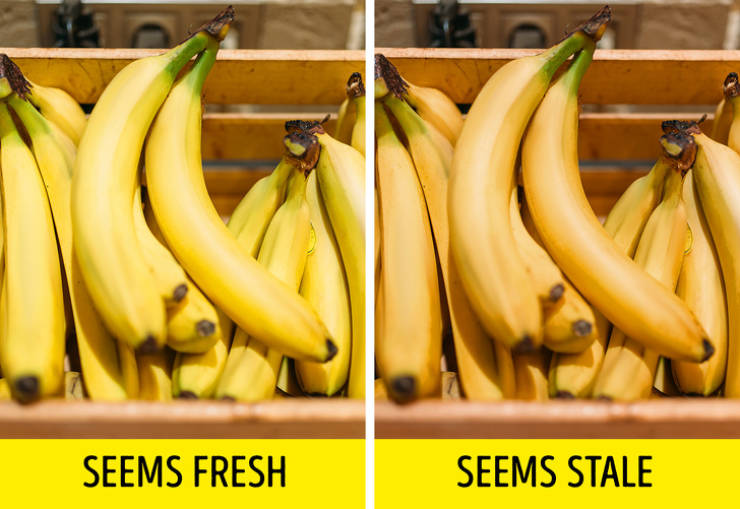
Banana suppliers know what color this product should be to make you perceive them as fresh and want to buy them. Just for this, they came up with a universal color known as “buttercup” which got its name thanks to the similarity of the seemingly “fresh” color of bananas with the famous flower.
The sprinkling of water makes you perceive products as fresh.
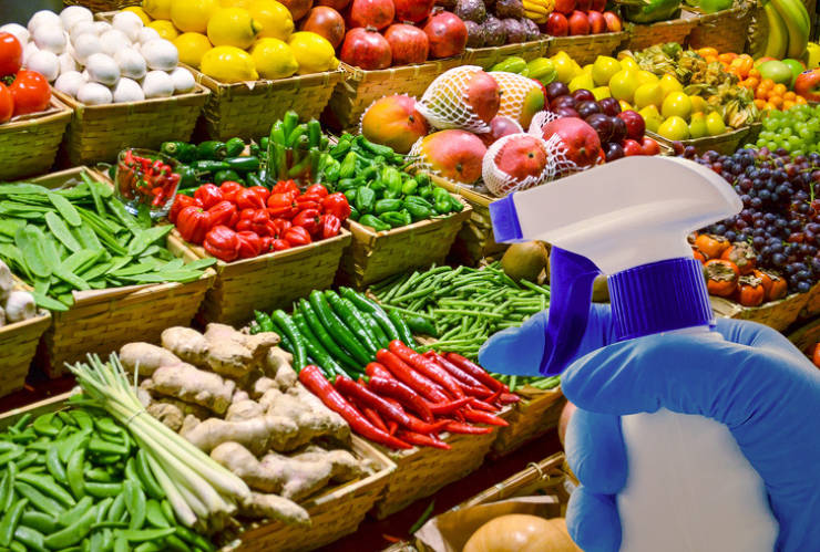
In order to make vegetables and products seem fresh on a shop shelf, Denmark came up with the idea to install small automatic dispensers in the stalls. Small drops look like dew and our brain perceives this as a sign of a product’s freshness. Many shops today use manual sprayers for this purpose.
You’re likely to pay more for packaging than for a product.
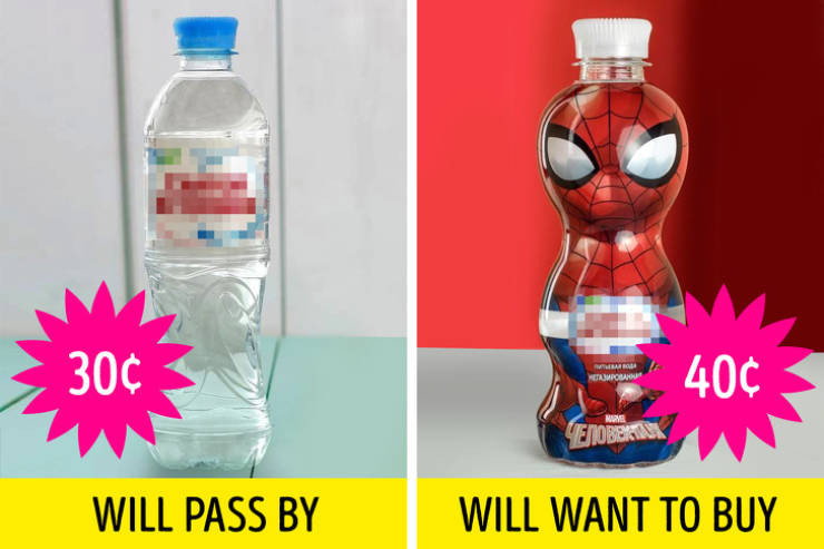
There are so many products in stores nowadays that manufacturers pit against each other not only by changing their volume and composition but also by the design of the packaging itself. For example, in order to showcase an ordinary bottle of water among many similar ones, marketers come up with a unique, bright shape so that you and your kids pay attention to it and feel a desire to buy it.
A change in packaging usually leads to an increase in the cost of a product, however, its composition and quality stay the same. Either way, people are ready to pay a bit more simply because they like the new design.
The special placing of goods
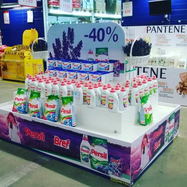
A large share of manufacturers’ advertising budget goes to in-store product placement so that you accurately notice their goods and want to buy them. For example, sales of products displayed on a special, branded shelf are 20% higher than the sales of products located on everyday shelves.
In order to make a choice for you, merchandisers sometimes throw up stubs and other garbage to make the stall look inaccurate and shabby. This trick might kill the desire of a potential buyer to take products from such branded stands.
Locomotive goods
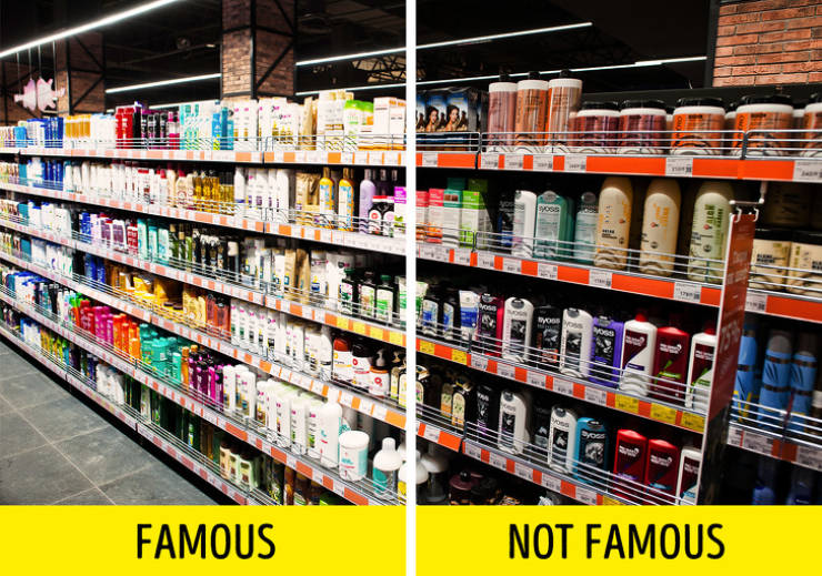
When you come to a store to buy a popular product, it’s usually located at the edge of a shelf — and it’s not for nothing. This locomotive product, as marketers call it, draws in your attention among neighboring goods you’d look at anyway. For example, it happens when you’re searching for your favorite shampoo on a seemingly endless shelf.
Usually, when there are no locomotive goods left on the shelf, the products located next to it might be standing idle for weeks. That’s why supermarket workers carefully check if there are empty gaps on shelves. They keep moving the products and putting them in the right order so that you get lost in such a wide array of choices and stay in the shop for longer.
Paired groups
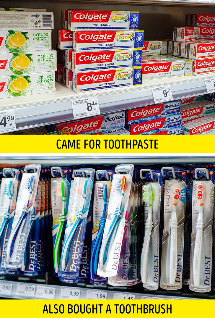
When placing goods in shops, the principle of making logical pairs is used. For example, tea and coffee go together with sweets, and sausages are combined with ketchup. It’s meant to make you buy several more items even if you came to the market to buy one thing, like toothpaste. You’ll suddenly remember that it’s high time you replaced your old toothbrush, especially since it has such “a nice-looking discount today!”
Big brother is watching you.

Cameras in supermarkets are not there to watch for theft. The cost of products in shops actually includes the extra price in case they’re stolen, smashed, or eaten right on the spot. In fact, cameras are only needed so that product promoters can observe customers’ behavior.
There are even special devices that monitor body temperature and catch people’s tiniest emotions when they’re looking at a certain product. This data is collected and gets analyzed to understand what affects a customer’s decision to buy or not buy a certain product. It also helps to find the best trading spot in the shop.
 Barnorama All Fun In The Barn