In any food business, when producing your brochure or website menu is part of your marketing strategy, the photos will be one of the most important elements. Among all other things to consider in making your menu, photography is one of them. Photos are an effective way to lure people into buying products because it helps create appetite and improve sales.
When you take photos of your restaurant dishes, remember that the purpose is to entice potential customers. These photos should be able to communicate your food as attractive, inviting and mouth-watering. In this article, we give some tips on how to take food photos for your brochure design or menus and improve sales.
Choose The Right Location
For food-related modern brochure design, always shoot your food in a clean and well-lit area, especially when using natural lighting. If you want to enhance the camera flash or reflectors can be used by placing them on the opposite sides of where the light source is coming from. Try to avoid direct sunlight.

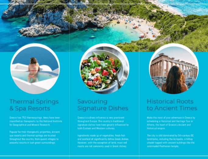
Source: Venngage
Make Sure Your Plates and Dishes are Clean
This may sound like a given, but you’ll be surprised how many people forget this or simply do not bother. Regardless of how good your brochure design templates are, a dirty food or dirty plate can make your customers hesitant to order the dish and they will start to question the hygiene of your restaurant. That is why it is important that you keep your place clean too.
If you are shooting on location, make sure the table is free of other objects. Avoid placing your plate of food on top of other items that might distract the focus of the photo or cover up part of the dish. Also, try not to put napkins or spoons in front or in the frame if they will cover part of the food.
You could also use a white background for your brochure design cover to make your photo look clean and professional. The easiest way to do this would be using either a white table cloth or a poster board. If you don’t have these materials available, simply place paper towels or napkins under the dish and beside it so it will cover up anything that is not supposed to be in the photo.
You can also choose to use light-colored patterned tablecloths or wallpapers for your brochure design ideas. Just make sure everything else is white, so your food stands out. Having a white background will help create focus on the food and capture customers’ attention when they see it online or inside your brochure.
If you need an online brochure maker, try out Venngage.
Use a Good Camera and Lens
You can use an SLR camera with a fixed lens or a digital camera, but the most common is using a point-and-shoot digital because it has fewer technical problems than an SLR. Make sure you choose the right settings on your camera so you get high-quality images that will look good in print.
If you are taking photos indoors, the most important thing is to have good lighting. Shooting in natural lighting is always best but if it’s not possible, using studio lights or a camera flash will help improve the quality of your photo.

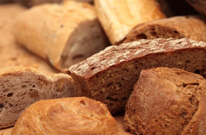
Source: TiBine/Pixabay
Choose Your Angle Wisely
There are two things to consider when choosing the angle you want for your shot- whether you are taking a portrait or landscape photo. A portrait photo is most often preferred by food stylists because it captures the dish in its entirety and most customers prefer to see what they’ll be eating when they order from the menu.
Don’t forget to get down on your own level when shooting your dish. Get close enough so customers could almost taste the food. This is important because it lets the customers know what they will get when they order from your menu. Make sure you show enough to entice your customers but don’t go overboard and cut off any important elements of the dish such as its name or ingredients.
For a landscape photo, using a wide-angle lens is best because it captures a larger view of the dish and its environment. This is often used for brochure shots but not usually preferred by food stylists.
Shoot from Different Angles
Try taking photos from above or below- this can help add a sense of creativity to your photo while giving you some interesting angles. Shooting a plate straight on will only get you so far before it gets boring. Experiment with different angles and your photo will be more interesting.
“Choose an angle that best showcases what the dish is supposed to look like.”
Avoid Using Flash
It can flatten out food, distort colors, create shadows on faces, reflections in glasses, and cause glare on textures of food.
Shoot Your Food Before You Eat It
Take some test shots to get different exposures and angles so you know what your dish will look like before you start eating it. Make sure you take lots of pictures because it’s better to have too many than not enough when shooting for a creative brochure design.
In Summary
You can take a great picture of your food, but it will never be as good as the real thing. This is especially true when you’re trying to sell an entree or appetizer in a brochure for your restaurant. So the next time you take out that camera and start snapping photos of your delicious dishes, think about these tips.
 Barnorama All Fun In The Barn