Think about your life. How many months have you spent on this Earth? How many weeks? Most of the time, we’re not aware of how long we have actually been alive, down to the day. Isn’t that a strange thought?
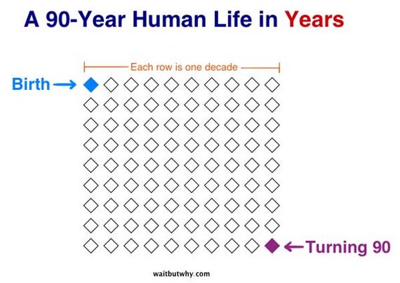
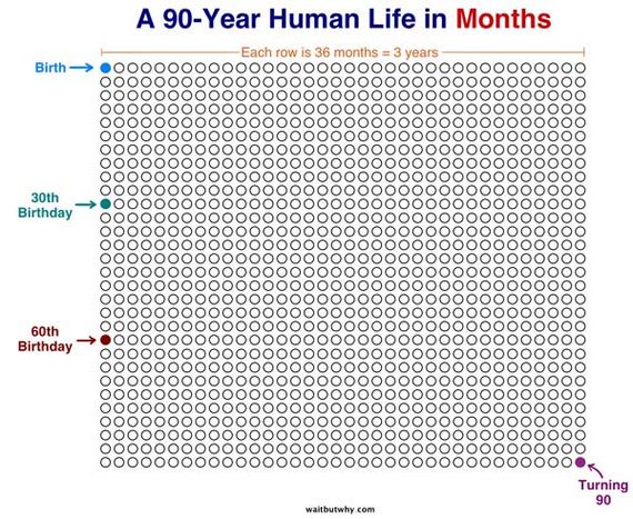
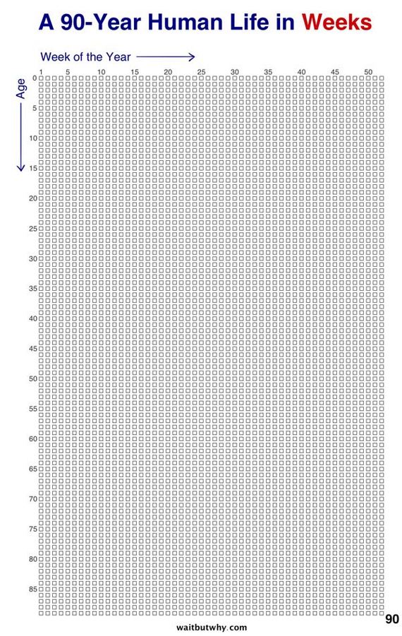
It’s even stranger to see a visual representation of just how long you’ve been around. This website illustrated what the human life typically looks like in years, months and weeks. It’s startling to know just how small the number of years we’ll have on this planet looks like. These images are both inspirational and slightly depressing.
This is what your life, in years, looks like.
Now, in months.
This represents your entire life in weeks. Is it more or less than what you thought it’d be?
This is how most people’s lives look according to the stages they are in.
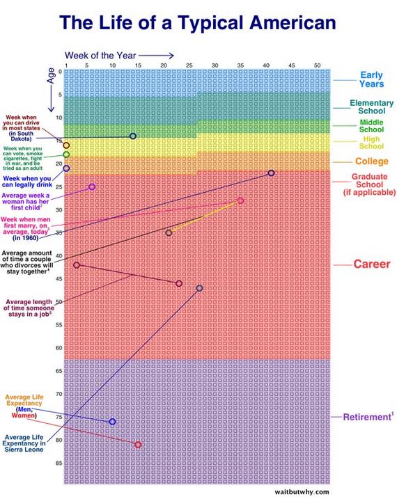
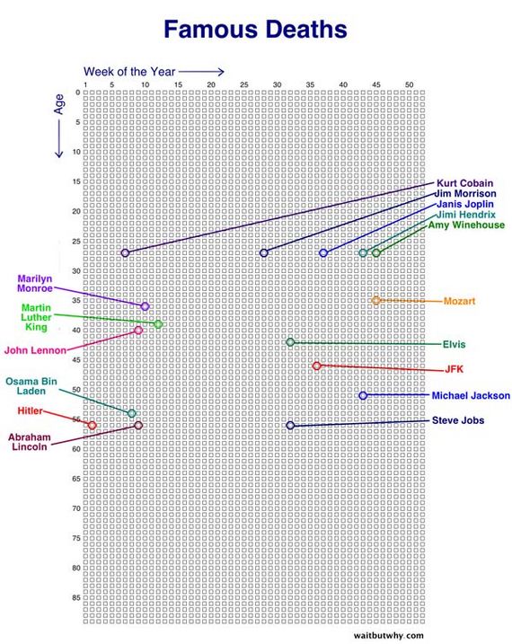
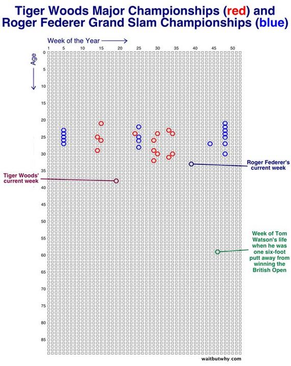
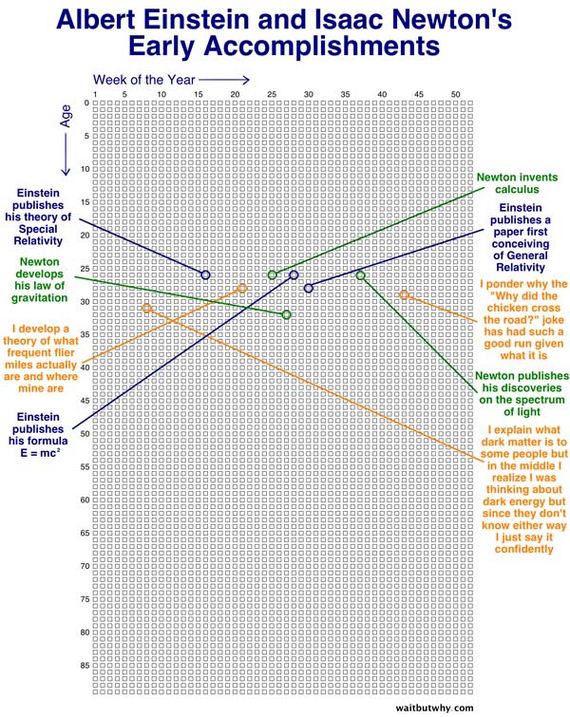
Where do you stand on this chart?
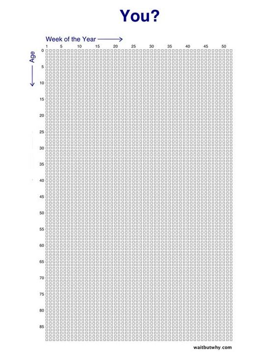
Don’t let your weeks be failures.
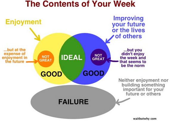
If you were to fill in one of these life charts by the week, where would you stand? Have you accomplished what you wanted? It can be depressing to see just how many little blocks we have left in our lives… but it can also be motivating. We have a finite number of weeks left to live. We should never waste them being unhappy or doing something we don’t want to do.
Share these mind-blowing charts with your friends and family; no one should let life pass them by.
 Barnorama All Fun In The Barn
