Sex and the City 2
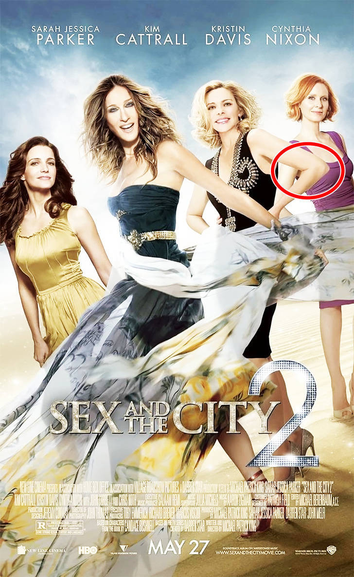
Kim Cattrall’s elbow turned out to be bigger than her neck and her forearm is incredibly long.
Death at a Funeral
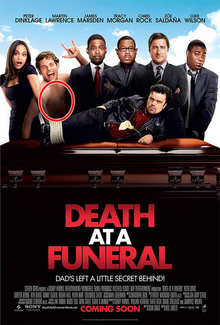
The designers obviously forgot to make everything about the film funny (including the poster) and failed to add something to one of the character’s chests.
The Heat
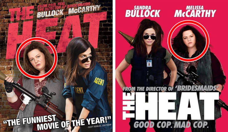
Actress Melissa McCarthy has never been embarrassed about her size but one graphic designer still decided to edit her picture — and we think it was a tad overkill.
The Accidental Husband
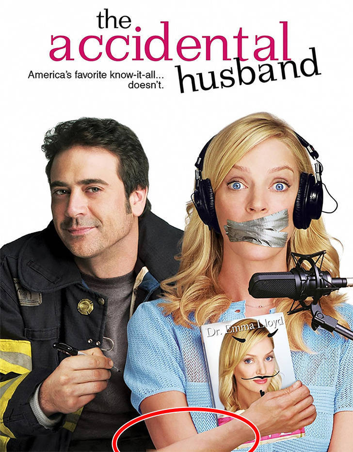
There was probably something really distracting happening while the designer of this poster was working. In the first poster, he never quite figured out where Uma Thurman’s elbow should be.
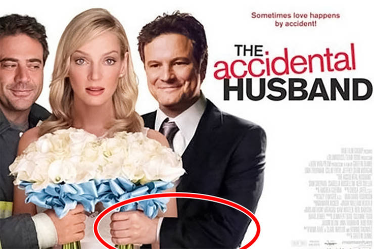
And in this poster, Colin Firth’s arm is really short and his wrist looks incredibly wide.
G-Force
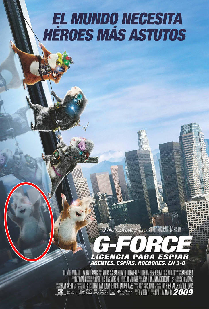
Take a close look at the reflection of the guinea pig. It’s weird — why do we see its face in the reflection if it has its back to the window?
Spider-Man 2
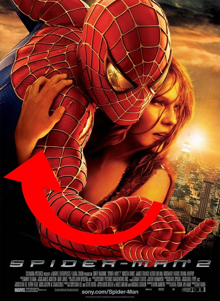
Most likely, the designer of this poster didn’t know much about human anatomy. It’s hard to believe that Kirsten Dunst would be able to hug Spider-Man unless she had a rubber arm that could stretch.
The Amazing Spider-Man 2: Rise of Electro
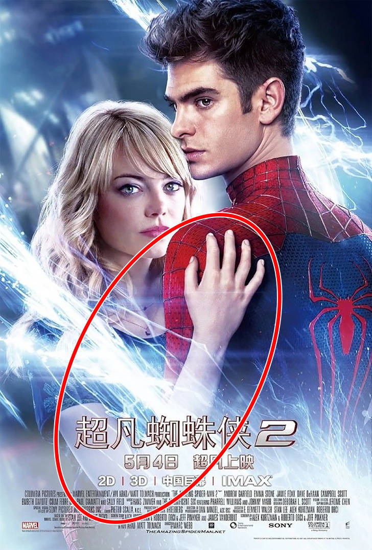
Somehow, another Spider-Man film made our list! And again, the film’s leading actress, Emma Stone, has an arm that’s incredibly long and unrealistic.
Everybody’s Fine
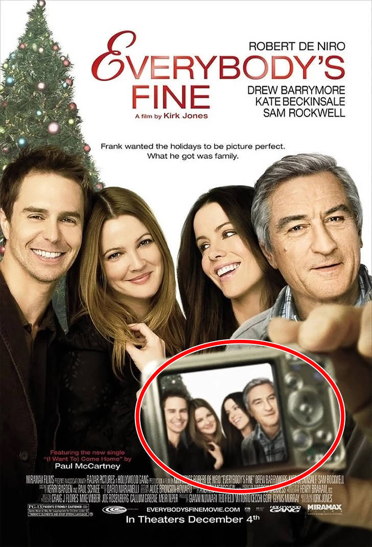
The hand holding the camera looks as if it belongs to someone else but not to Rober De Niro. Otherwise, it’s hard to imagine how this shot would’ve been taken by a camera at this angle.
Highlander: Endgame
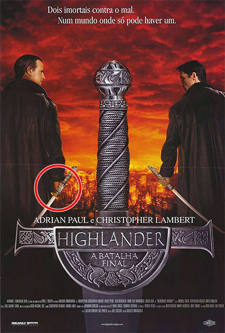
The designer of this poster obviously didn’t care much about their work since they decided to place the sword just above the actor’s hand as if it were just floating there.
Dragonheart: A New Beginning
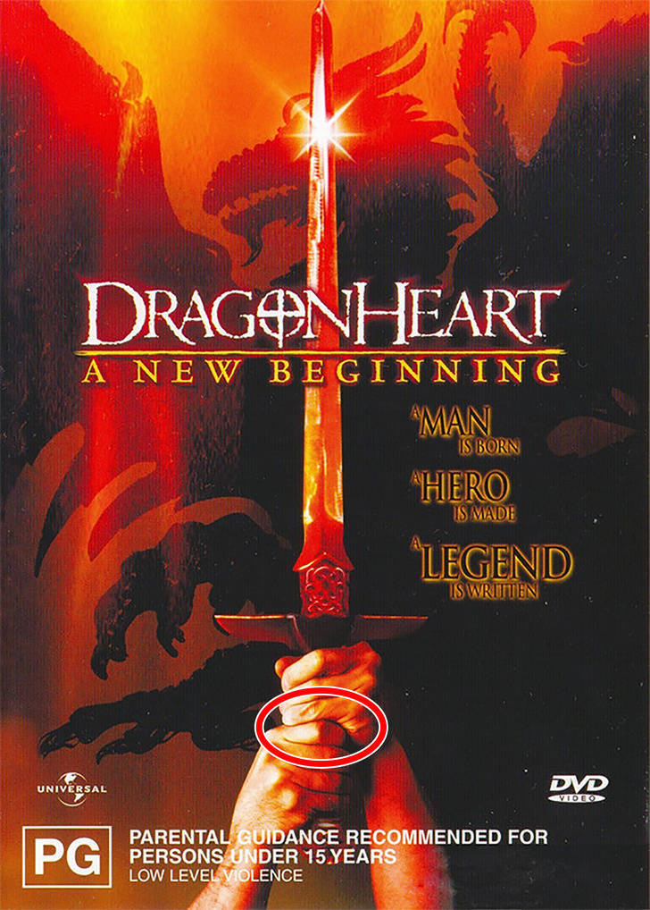
Look closely at this poster and count the number of fingers on the sword. It seems that someone erased one of the fingers and only a knuckle is visible.
Bangkok Dangerous
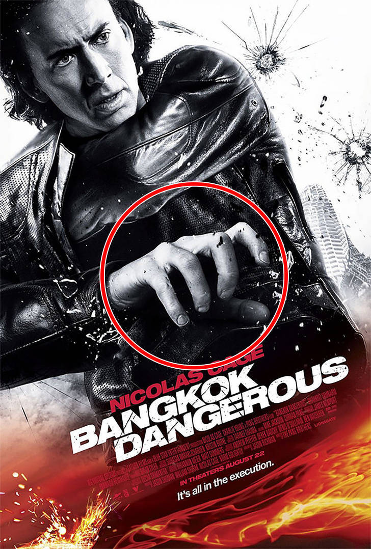
It looks like Nicholas Cage was supposed to be holding something in his hand but the designer forgot about it. Otherwise, why would Cage do this with his hand?
Snakes on a Plane
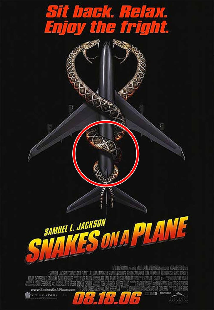
If you look closely, you can see that a part of the snake is gone.
16 Blocks
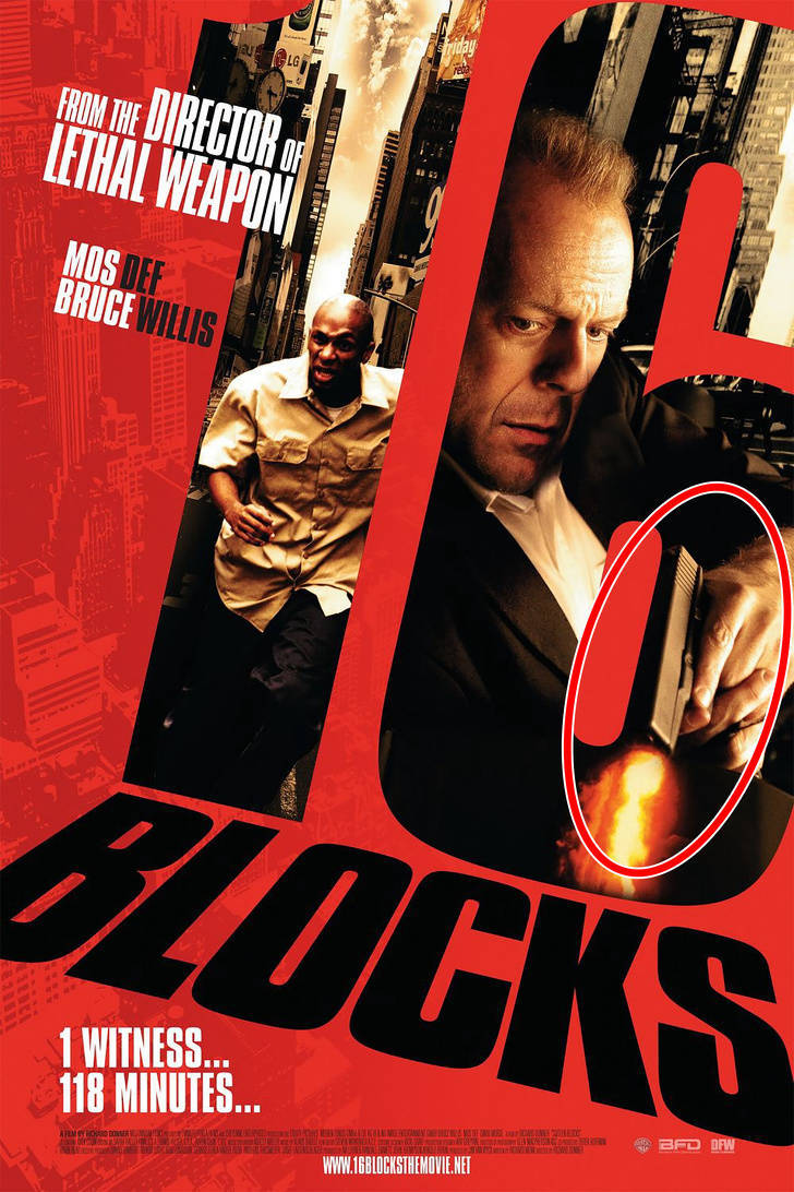
There’s nothing really interesting about this poster other than the fact that Bruce Willis doesn’t have a mustache but his character in the film does. Also, the gun is shooting even though his finger isn’t on the trigger.
Street Kings
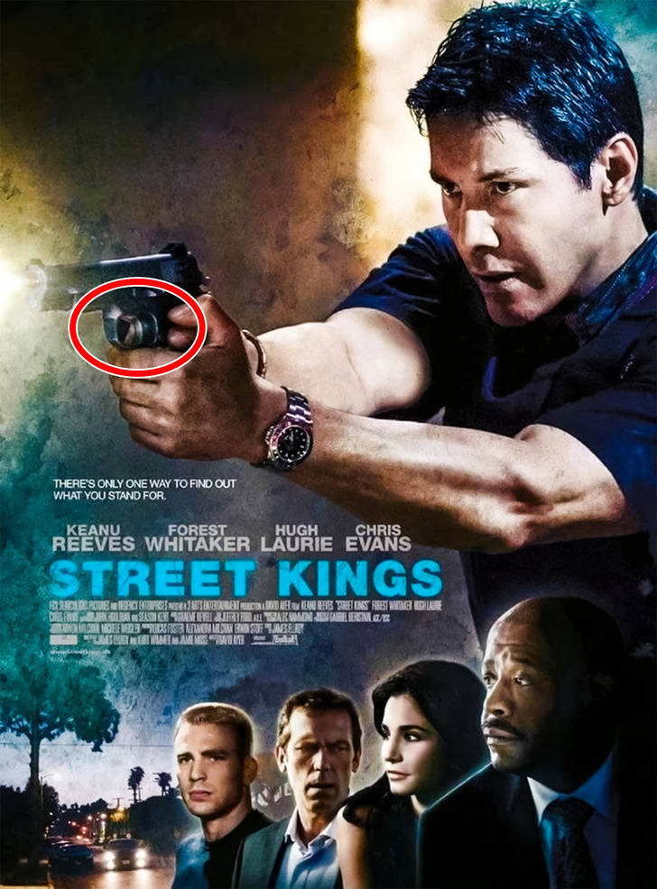
Keanu Reeves can also shoot a gun with the power of his mind as he doesn’t need to pull the trigger to make a shot.
Godzilla: King of the Monsters
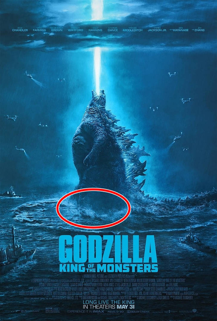
There was a small scandal that took place over this poster. The viewers couldn’t understand how Godzilla could just float in the water. What is the lizard standing on?
Ride Along
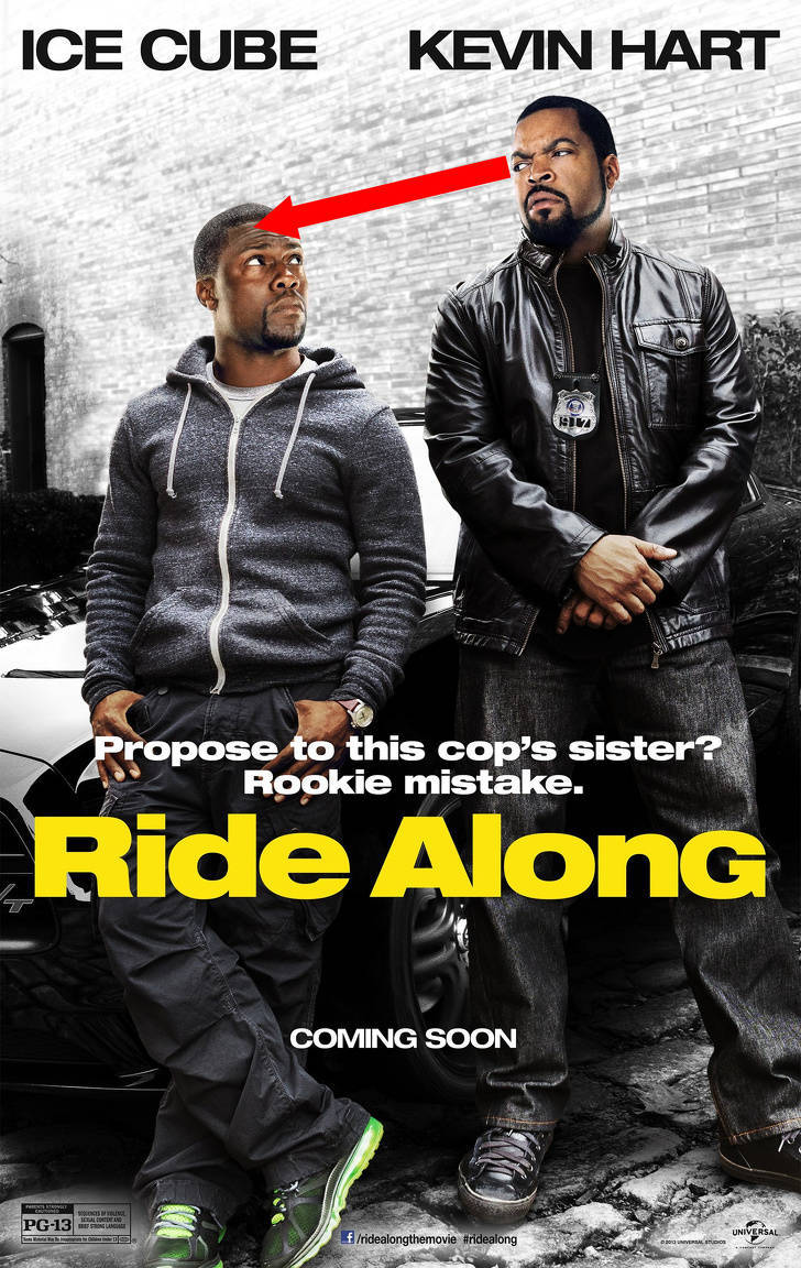
For some reason, the designer decided to place the characters in a way so that Ice Cube could look directly at Kevin Hart’s forehead. Even though in real life they’re almost the same height, the poster gives the impression that one of them is significantly taller than the other.
Arrival
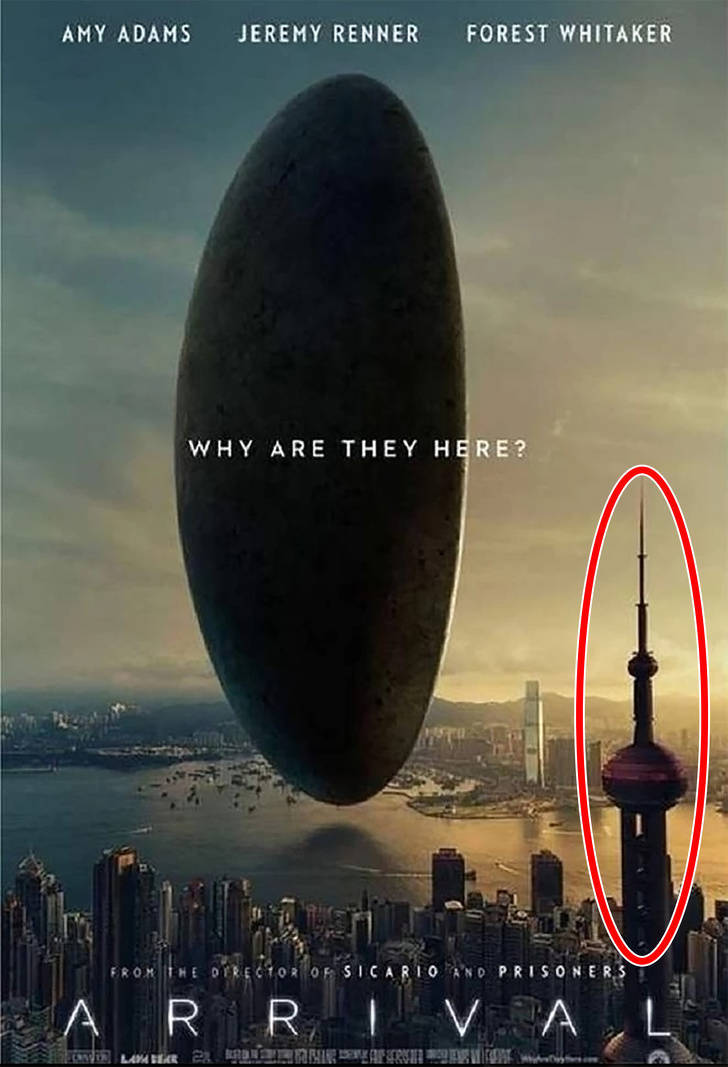
At first sight, the poster looks perfectly normal for an alien movie. But in Hong Kong, you can see the poster doesn’t have the Oriental Pearl Tower because it’s actually in Shanghai.
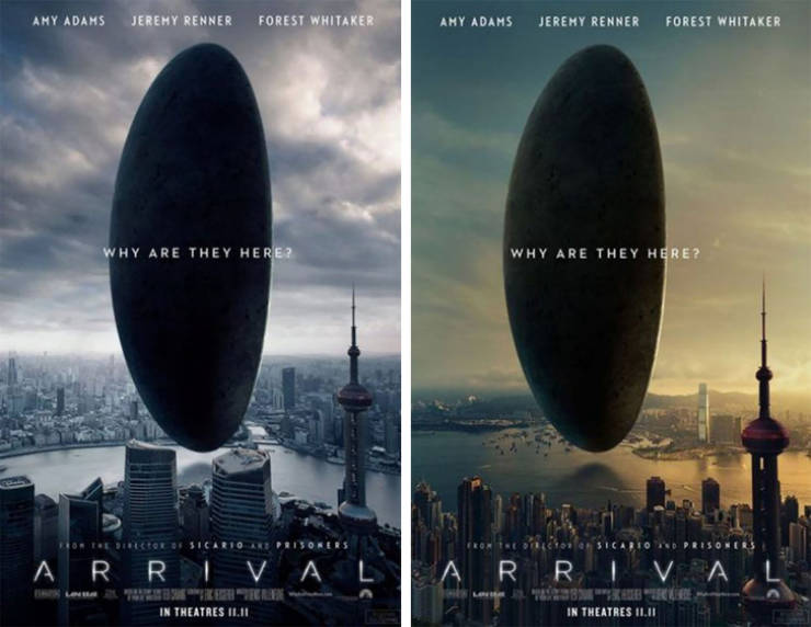
This poster caused such an outcry in Hong Kong that the creators had to change it very quickly. That’s why the designers moved the alien ship to Shanghai.
I Am Wrath
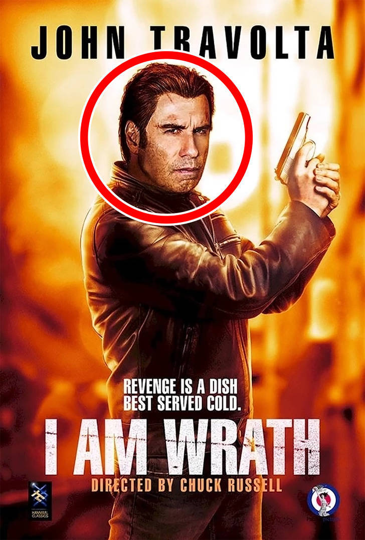
A designer did something weird with John Travolta’s head in this poster. For some reason, it looks disproportionate to his body.
Chef
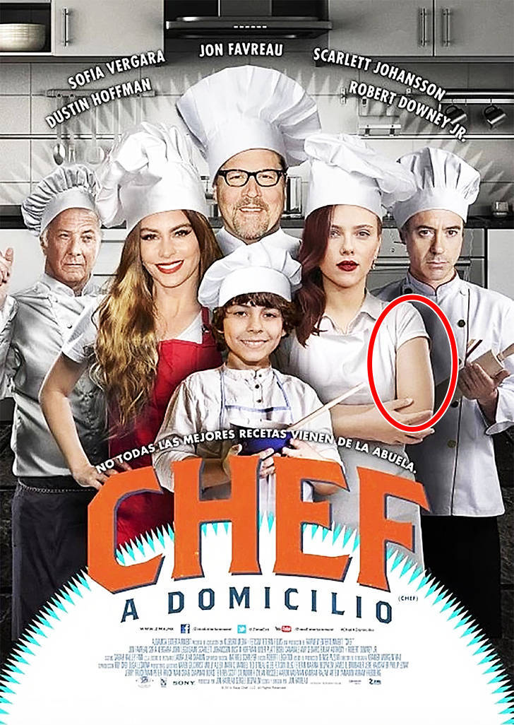
The hands of Scarlett Johansson have a different skin color than her head. And the photo of Sofía Vergara looks as if it was taken on the red carpet and then edited into this poster. Also, her head looks too big compared to her body.
The Greening of Whitney Brown
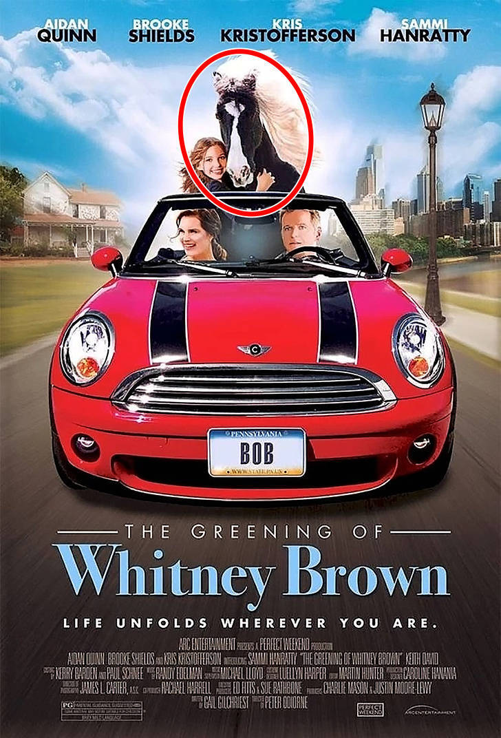
We wish we could’ve seen the face of this designer when he realized it was nearly impossible to put a real horse in the back seat of a Mini Cooper.
Wanted
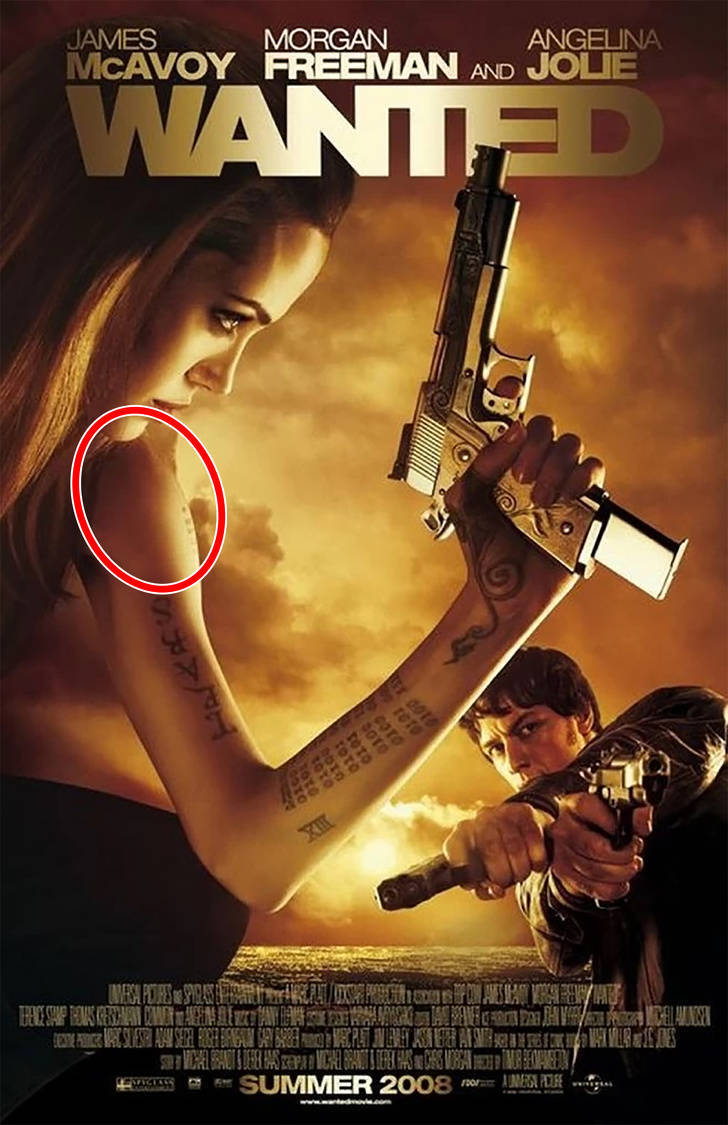
At first sight, the poster looks okay. But if you look closely at Angelina Jolie’s hand, you will see that her shoulder goes right out of her chin and the forearm is too long and unrealistic.
Star Wars: Episode VI — Revenge of the Jedi
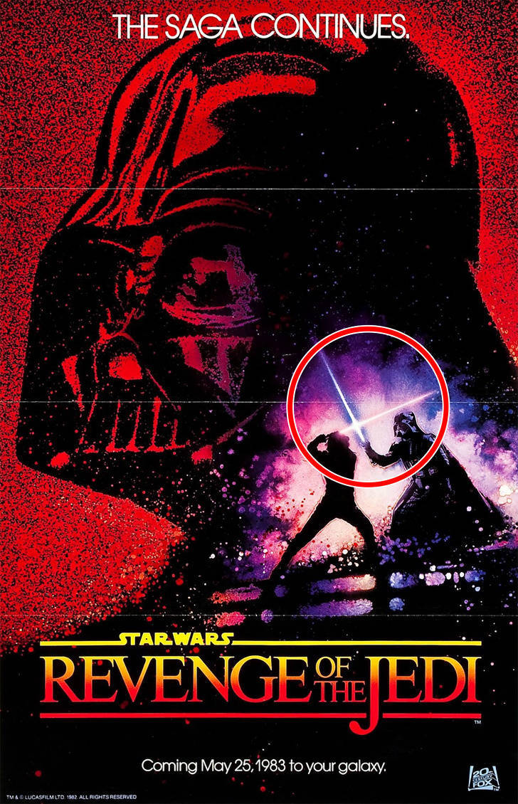
The mistake on this poster is obvious only to a true Star Wars fan. You can see Luke Skywalker and Darth Vader fighting with lightsabers that don’t belong to them. The designer of this poster confused the positions of the weapons and the main characters.
The Babysitter
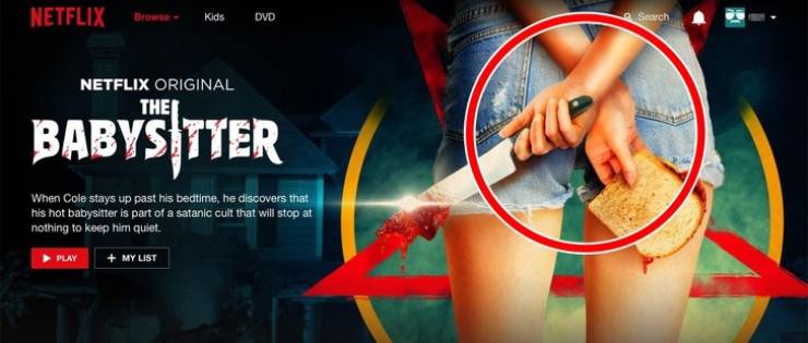
Somehow, the designer here decided that the actress should have 2 right hands.
Pretty Little Liars
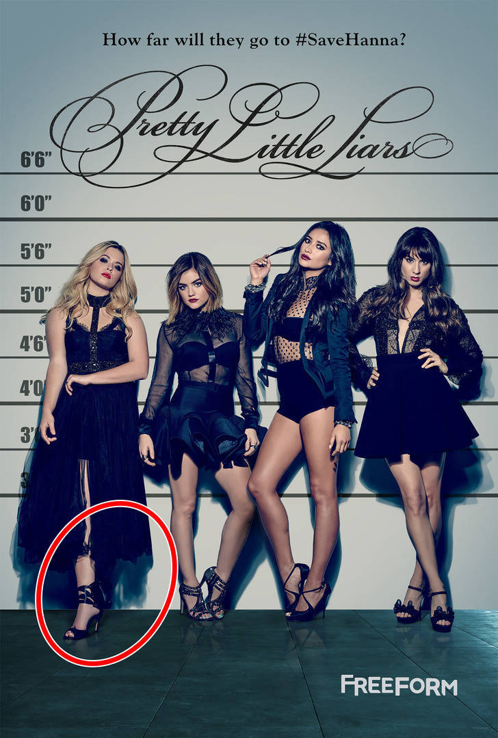
Movie posters aren’t the only things that suffer at the hands of non-attentive designers — posters for popular TV series do too! For example, where did the left leg of the actress on the far left go?
 Barnorama All Fun In The Barn