This compilation is not just a feast for the eyes but a source of inspiration for those who appreciate the sophistication that comes with pared-down designs.
It highlights how designers and innovators across various fields are turning the conventional on its head by proving that less can indeed be more.
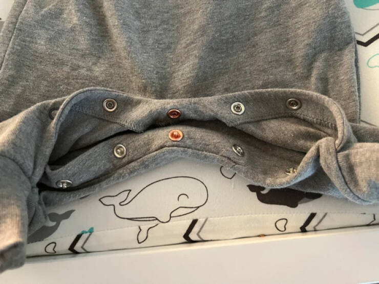
“My son’s onesie has a different color button in the middle so it’s easier to line them up properly.”
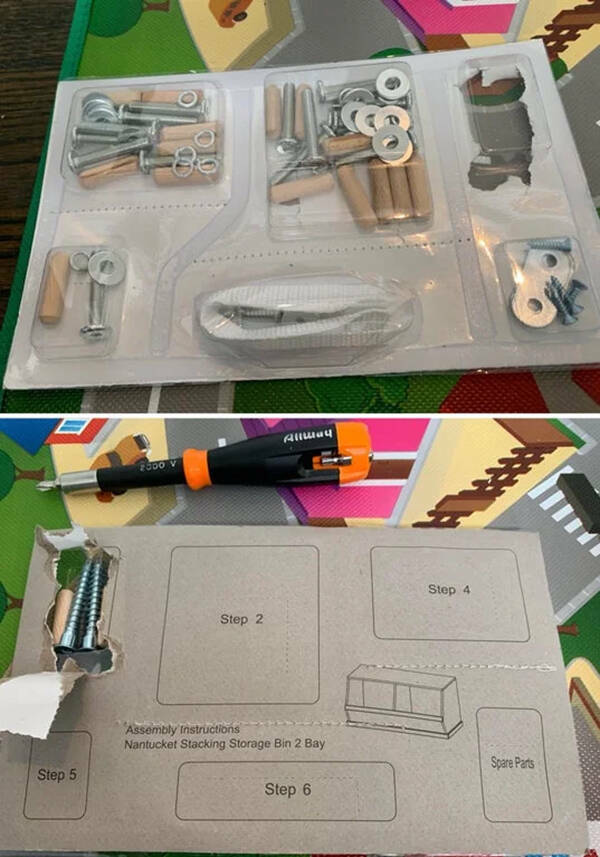
“This furniture hardware is sorted by step rather than by type.”
“Solar park bench with USB charging ports.”

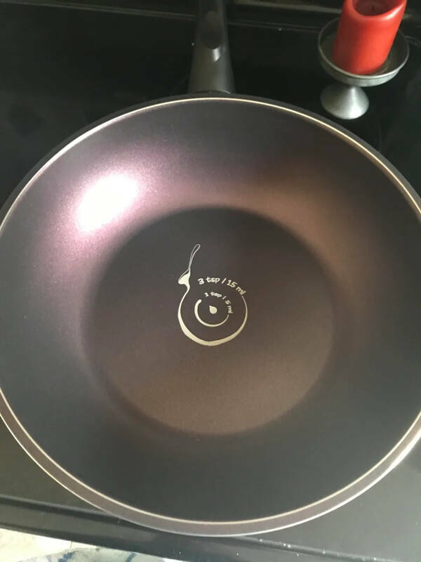
“My new wok has circles for measuring oil.
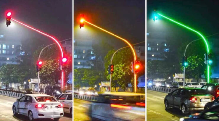
“Traffic signals with LED lights on the pole itself.”
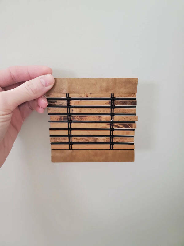
“I ordered some sample colors for new blinds, and they sent me actual tiny little blinds.”
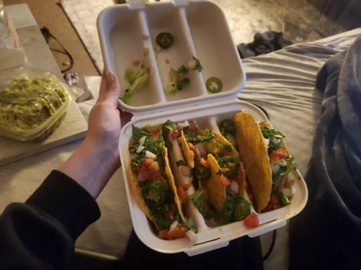
“My 3 tacos came in a container that was made to hold 3 tacos upright.”
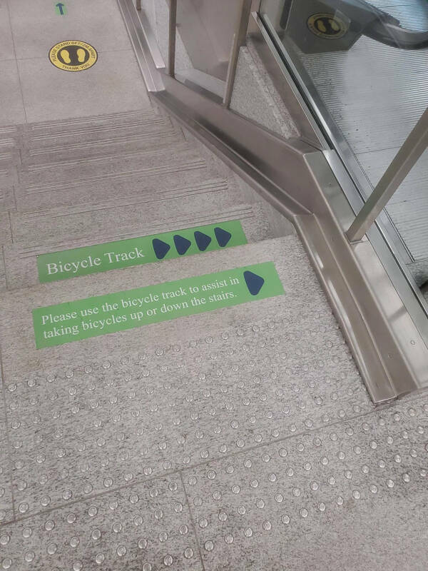
“This track to help people bring their bikes up or down stairs.”
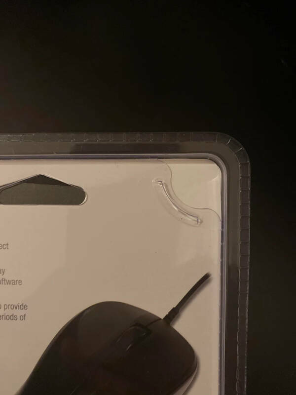
“A simple easy-open tab on this computer mouse package was a welcome surprise after a long day of moving into a new apartment.”
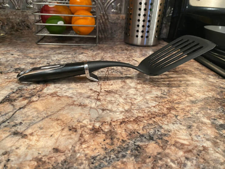
“My spatula has a little stand so it doesn’t touch the counter.”
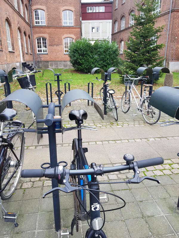
“This rooftop for bicycles so the saddle won’t get wet.”
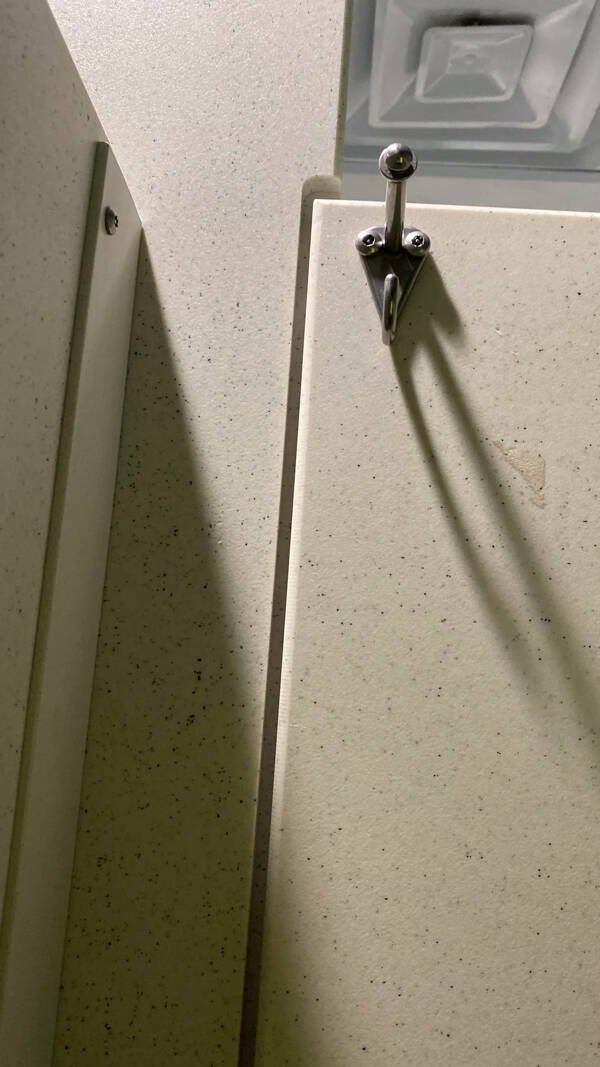
“Bathroom stall door with no crack in between.”
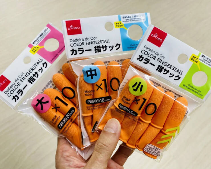
“Cutout in the packaging allows fitting test.”
“My whey has a little hook to put the scoop on.”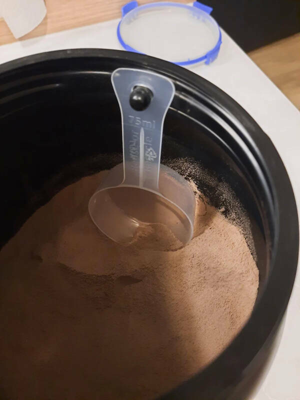
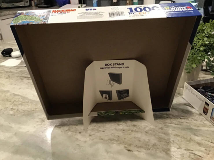
“My puzzle came with a stand for the box.”
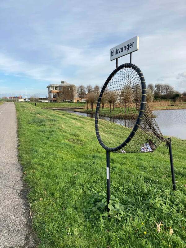
“There are bins along cycle paths in the Netherlands which allow you to throw out rubbish without slowing down.”
“Bedsheets that are labeled with what side is the top/bottom or sides, so you don’t have to spend hours spinning it around to find what fits.”

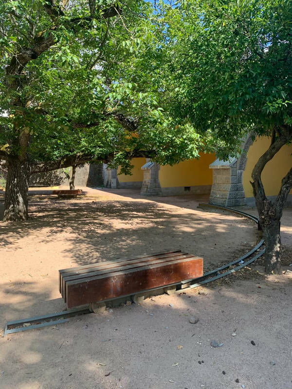
“They put rails under the benches in this park so you can always be in the shadow.”
“My empanada says what meat is inside.”

“A beer bucket with a beer opener on the side.”

“These 15mg buspirone tablets can be broken into 5mg doses or 7.5mg doses depending on which side you split the tablet.”

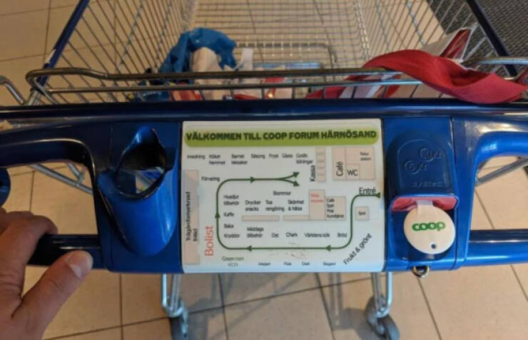
“Supermarket trolleys in Sweden have a map of the supermarket for guiding.”
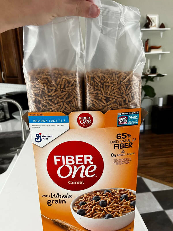
“Family size cereal comes in two half-sized bags, so that it doesn’t get stale too quickly.”
 Barnorama All Fun In The Barn