- 85shares
- 85
“You chose this out of all the design options?”
The braille on the “alarm” and “stop” buttons on this bus are the same.

This was supposed to be motivating.

“Never quit. Do your best.”
“Never do your best. Quit.”
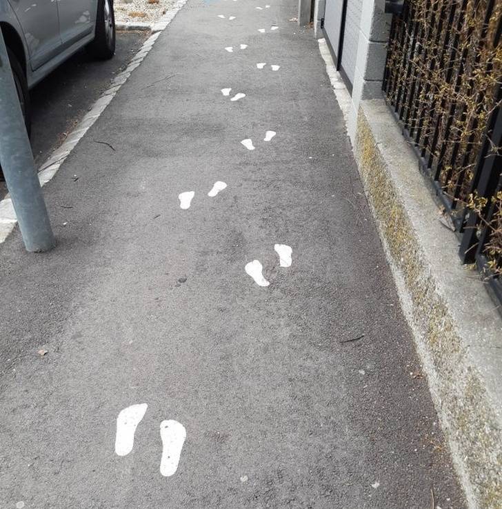
Someone must’ve decided that this is exactly how a normal person walks.
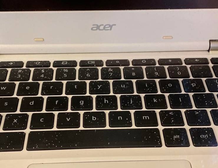
This laptop keyboard’s design with white splatter-paint makes it look like it’s covered in dust and dandruff.
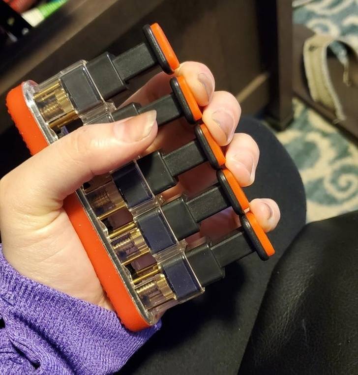
“My boyfriend’s finger exerciser has 5 buttons. But how can you get the thumb to reach?”
“A pillow at my grandparents’ house”
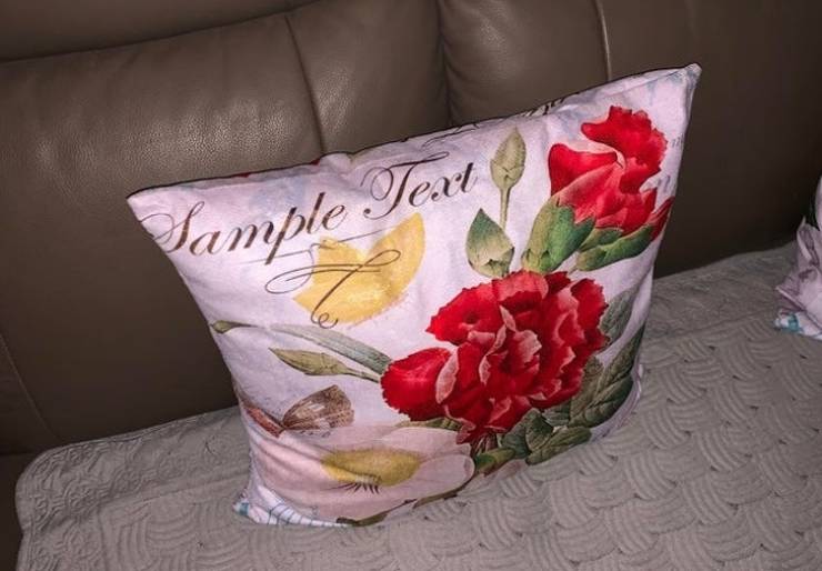
“Sample text”
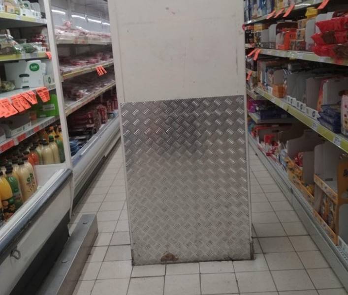
A support pillar is placed in the middle of the aisle. It’s a dead-end behind it so you have to leave your shopping cart here and go around to take stuff.
Meat packaging that makes the product look moldy

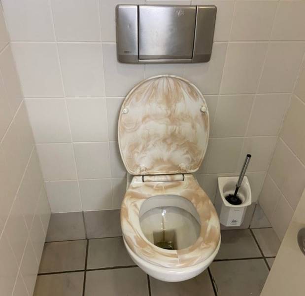
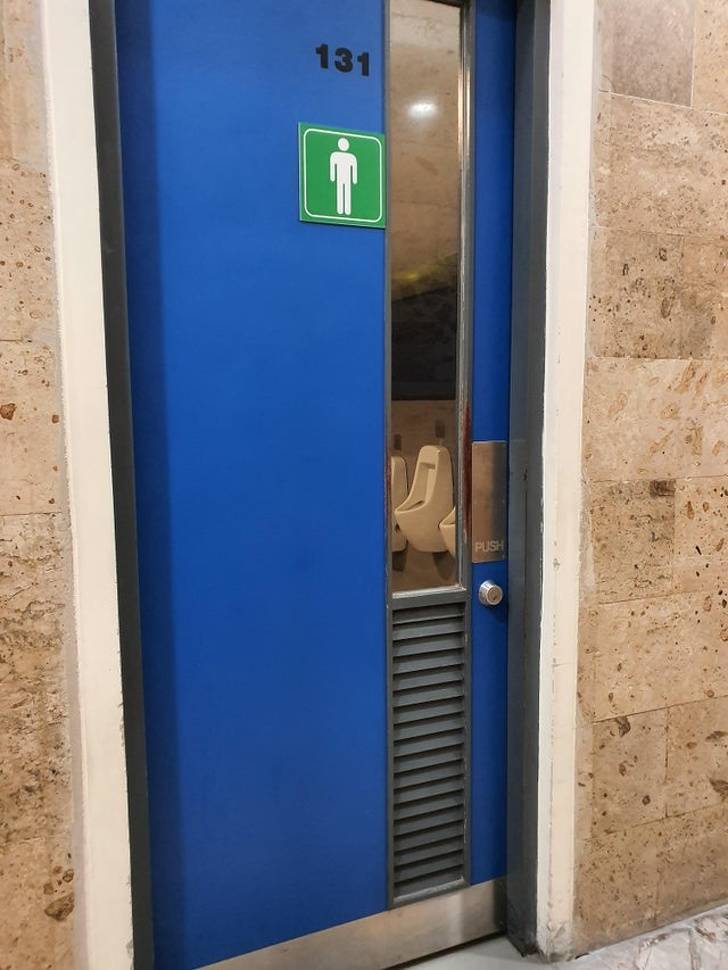
A private place that doesn’t look so private anymore…
This image is supposed to represent working like a machine with each individual being a cog. But the gears can’t spin!

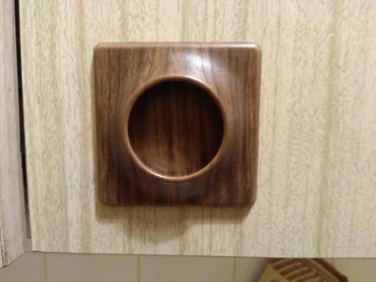
“The handles on my kitchen counters are hard to grasp, hard to clean, and have a recess at the bottom that attracts crumbs and dust. There are 14 of them!”
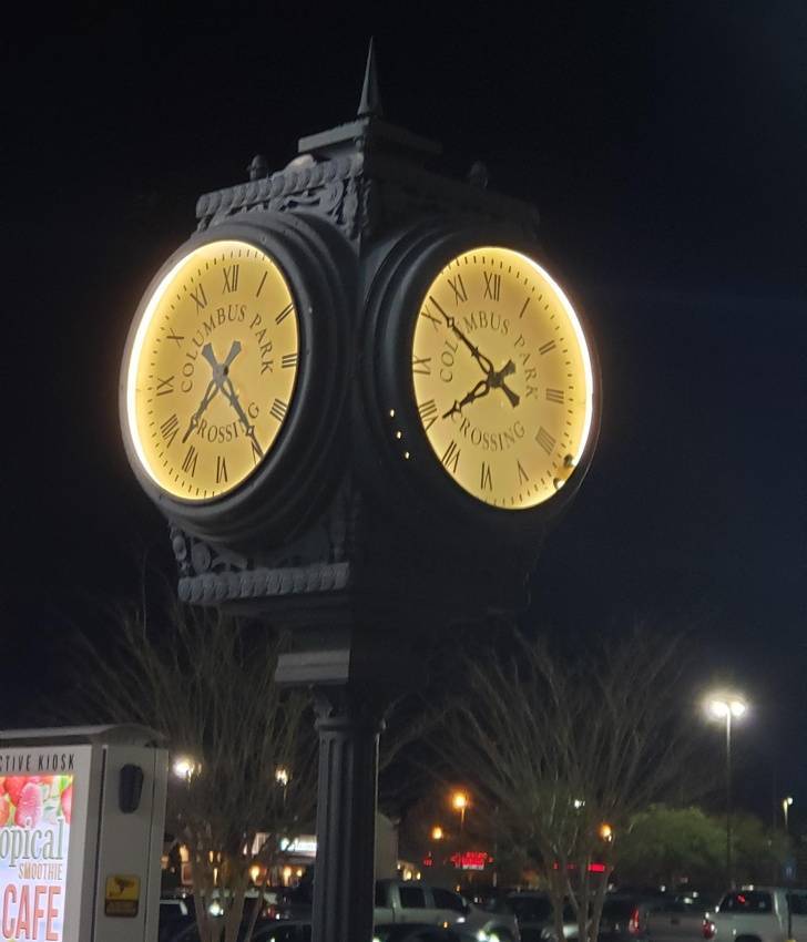
This 4-sided clock shows 2 different times. And both of them are wrong.
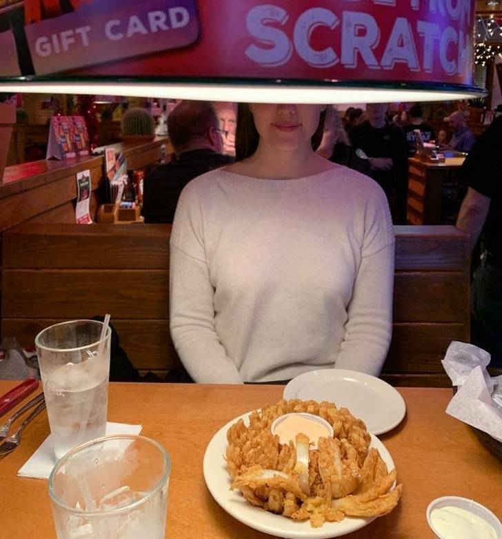
“I love not being able to see the person I’m eating dinner with.”
“This landmark in my town was gone for over 2 years due to restoration. This is what it looked like when it returned.”

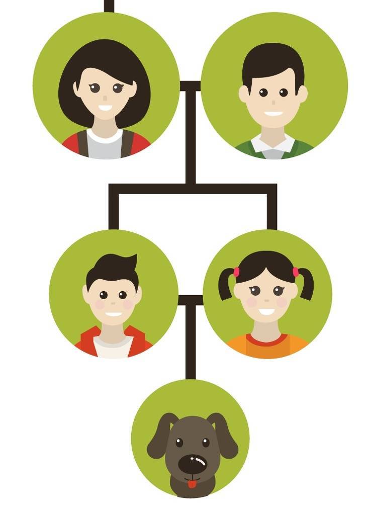
It doesn’t work this way.
Bonus: Only the highest person in the world can open these blinds.

- 85shares
- 85
 Barnorama All Fun In The Barn